
No mobile version available
This portfolio is design for larger resolutions devices such as tablets or desktops.
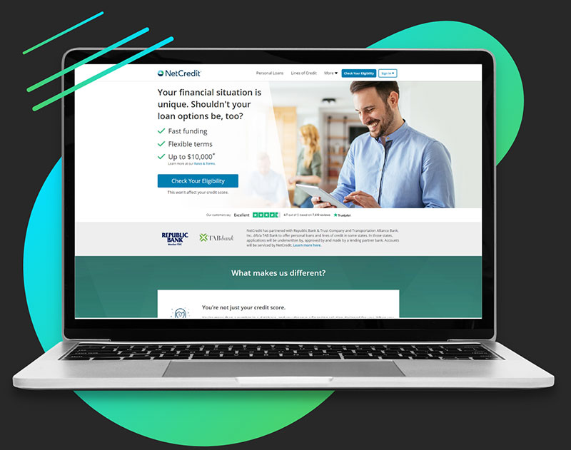
NetCredit
Web Site Project
Project Overview
NetCredit is under the Enova International brand. NetCredit provides personal loans up to $10,000 and line of credit up to $4,000. The project was a complete redesign of a 6 year old site.
Company
Enova International
Role
Lead UX Designer
Individual Contributor
Team
1 Lead UX Designer (me)
1 UX Designer
1 Developer Manager
2 Developers
1 Lead QA
Tools
Figma
Figjam
Confluence
Jira
UsabilityHub
Timeline
Total project time: 8 months
Design: 3 months
Development: 4 months
QA: 1 months
Deliverables
Research plan
Qualitative research
Wireframes
Prototypes
Usability tests
Project Phases
Problems and Goals

Challenges
The two main challenges I faced included:
- Complex and Lengthy Application
Process One of the UX challenges faced by NetCredit was the complex and lengthy application process for their online loans. Users found it difficult and time-consuming to complete the application, resulting in a high abandonment rate. Simplifying and streamlining the application process while still gathering the necessary information would be a key challenge. - Low Conversion Rate
NetCredit faced a business challenge of low conversion rates on their website. Despite attracting a significant number of visitors, the conversion rate for loan applications was relatively low. Improving the overall user experience and addressing any usability issues would be essential to increase the conversion rate and ultimately boost business revenue.

Goals
To overcome the challenges, the team and I set clear goals aimed at the challenges.
Simplify the Application Process
The goal is to streamline the application process by reducing the number of steps and making it more user-friendly. This will involve analyzing the existing application flow, identifying potential bottlenecks, and designing a simplified and intuitive process that requires minimal effort from the users.Improve Completion Rate
The goal is to increase the completion rate of loan applications by optimizing the user experience during the application process. This involves identifying pain points and areas where users commonly abandon the process, and implementing design enhancements, such as progress indicators, clear instructions, and error handling, to guide users through the application seamlessly.Enhance Call-to-Action (CTA) Effectiveness
The goal is to improve the conversion rate by enhancing the effectiveness of the website’s call-to-action elements. This can be achieved by employing persuasive copywriting, designing visually appealing and prominent CTAs, and conducting A/B testing to determine the most compelling variations that drive user engagement and increase conversion.Optimize Form Fields and Validation
The goal is to optimize the form fields and validation process to reduce user frustration and increase completion rates. This can be accomplished by carefully selecting and organizing form fields, providing clear instructions, implementing real-time validation to minimize errors, and employing user-friendly input methods, such as autocomplete or dropdowns, where applicable.
Project Phases Breakdown
Discovery
Phase 1
In the discovery phase of the NetCredit website redesign project, extensive research was conducted to gain a deep understanding of the user base and their needs. This involved a comprehensive approach that included both quantitative and qualitative research methods. Quantitative research provided valuable insights by analyzing numerical data at scale, while qualitative research allowed for a more nuanced understanding of user behaviors, preferences, and pain points. By combining these research approaches, a holistic view of the user experience landscape was obtained, guiding subsequent ideation and design decisions.
The first step in the discovery phase was to create a research plan. I wanted to start with a research plan because it provides a structured approach, ensuring a systematic and organized process of gathering insights.
Here are some items that was covered in the research plan:
- Goals
- Ex. To understand user pain points around application.
- Research methods
- Qualitative: email and exit surveys
- Tools
- SurveyMonkey (surveys)
- Hypothesis
- Ex. Users may complete application more often if the each step of the form is short.
- Recruiting participants
- Website visitors and past customers
- Participant compensation


Web Analytics
Quantitative research involved collecting and analyzing numerical data to gain statistical insights using Google Analytics. This included conducting surveys among NetCredit website users to gather information about their demographics, loan preferences, and satisfaction levels. Additionally, website analytics tools were utilized to examine: user behavior patterns, such as:
- Click-through rates
- Bounce rates
- Conversion rates
- Funnel analysis
- Path analysis
These quantitative insights provided a broad understanding of user trends and patterns, helping identify areas for improvement and optimization
Surveys
Exit surveys were strategically implemented on the existing NetCredit website to capture feedback from users who were about to leave the site, providing valuable insights:
- Users could share reasons for leaving, frustrations encountered, and suggestions for improving website usability.
- Data collected from exit surveys helped identify pain points and user frustrations.
- Immediate attention and improvement areas were identified based on exit survey feedback.
Email surveys were also sent to existing NetCredit customers, aiming to gather feedback and insights on loan application experiences and overall user satisfaction:
- Targeted audience perspectives, needs, and expectations were captured through customer surveys.
- Qualitative data from survey responses shed light on customer satisfaction, areas of improvement, and opportunities for enhancing the loan application process and user interface.


Heatmaps
Heatmap analysis was employed to gain deeper insights into user interactions and behavior on the NetCredit website, aligning with the identified challenges and goals. The analysis focused on specific areas to address the complex and lengthy application process and to enhance the call-to-action (CTA) effectiveness.

Once I had collected all the research data from both interviews and surveys, we consolidated the findings into a spreadsheet. I then analyzed the data to identify recurring pain point themes and compiled a list of observations. To gain further insights, I employed a Rainbow Spreadsheet, which visually highlighted the areas with the most significant gaps, enabling us to prioritize and address the key issues effectively.
Top Findings
1
Application Form
Surveys revealed that users indeed encountered issues with the length of the application process, as it was perceived as time-consuming and complex. Additionally, users expressed dissatisfaction with the form fields, highlighting the lack of smarter functionalities like auto-complete and error detection.
2
Other Pages Had High Engagement
The heatmap analysis revealed that users showed high engagement and attention on the homepage, loan comparison section, and testimonial pages. However, users tended to spend less time on pages with lengthy form fields, potentially indicating cognitive overload and frustration.
3
Eligibility Clarity
30% expressed frustration with the lack of clear information about eligibility criteria and loan terms.
Ideate
Phase 2
In the subsequent phase of the project, the focus was on generating ideas for potential solutions. To approach this phase, I employed a strategy that started with a broad exploration, gradually delving into more specific design details.
To infuse the NetCredit website redesign with fresh ideas and innovative approaches, I sought inspiration from a diverse range of industries. I explored design trends and best practices beyond the financial sector, drawing insights from the following industries:
- E-commerce: Analyzing user-friendly interfaces and intuitive navigation systems in online retail platforms.
- Technology: Exploring interactive and seamless experiences found in software applications and digital platforms.
- Personal finance applications: Studying user-centric design principles employed in budgeting and financial management apps.

In the ideate phase, the subsequent step was to create Low-Fidelity (LoFi) wireframes, serving as a vital tool for generating and exploring diverse solution ideas that addressed the identified problems. These LoFi wireframes provided a simplified visual representation of the website’s layout, functionality, and content, allowing for rapid iteration and experimentation. By leveraging this technique, I could explore various design possibilities and iterate on different concepts to find the most effective solutions for the challenges at hand.


Design
Phase 3
After creating LoFi wireframes and the team agreeing on a direction, I reached a stage of confidence in crafting and refining High-Fidelity (HiFi) wireframes. This collaborative effort involved closely working with project managers and developers, conducting meticulous reviews and iterations of the wireframes to ensure their comprehensive refinement before finalization.
Notable design changes:
- Reduced number of section on home page
- Reduced number of forms for each application step
- Created steps early on in the application to check for eligibility
- Used buttons, icons, and imagery in the application steps
Displayed below are some examples of the wireframes that I created during this process.
Landing Page

Application Step

Application Step

Test
Phase 4

I conducted usability testing using UsabilityHub to validate the resonance of our design ideas with users. To achieve this, I developed a range of tests and distributed links to participants who had previously taken part in surveys. Testing methods included A/B split tests, 5-second tests, and flow tests, among others, allowing me to gather valuable insights and feedback to effectively inform the iterative design process.
Tested the following:
- Home page
- Length of application
- Application form error handling
- First application step
Top Feedback
1
Home page
Participants found the primary call-to-action (CTA) to be well-placed and visually engaging, encouraging them to explore loan options and proceed with applications.
2
Application Steps
Users expressed satisfaction with the clarity and simplicity of each application step, which facilitated a smooth and straightforward application experience.
3
Length of application
Users praised the comprehensive nature of the application process, appreciating how it gathered all necessary information to provide a tailored loan solution. Although the application had a slightly longer duration compared to previous versions, the presence of a progress indicator proved valuable as it kept users informed about their current step and the remaining journey, enabling them to gauge their progress and anticipate the time required.
Build
Phase 5
When transferring UX deliverables to the development team, the handover included the following:
- Finalized user stories
- Completed wireframes and prototypes
- Design specifications outlining visual and interactive elements
- Interaction rules to guide the development process
- Design notes documenting important considerations and rationale
- Redlines highlighting precise measurements and specifications for implementation.
This comprehensive handover ensured a smooth transition from UX design to development, promoting clear communication and facilitating the accurate implementation of the design vision.

The Results
Increased Conversion Rate
By optimizing the call-to-action elements and improving the user experience, the NetCredit website witnessed a significant increase in the conversion rate. The conversion rate increased by 20%, resulting in a higher number of completed loan applications and a boost in revenue.
Streamlined Process
Through iterative design enhancements, the application process was successfully streamlined, reducing complexity and improving efficiency. The average time to complete the application process decreased by 30%, leading to a 15% reduction in abandonment rates and a 25% increase in completed loan applications.
Enhanced User Experience
The website redesign resulted in an enhanced user experience, positively impacting customer satisfaction and engagement. The Net Promoter Score (NPS) increased by 10 points, indicating higher customer loyalty and recommendation rates. Additionally, user satisfaction surveys showed a 25% improvement in satisfaction ratings, highlighting the improved usability and clarity of loan terms.
Improved Revenue
The combined impact of UX improvements and business optimizations led to improved business performance for NetCredit. Key metrics and KPIs demonstrated significant growth, including a 30% increase in revenue, a 20% decrease in customer acquisition costs, and a 15% increase in the average loan amount. These improvements were attributed to the enhanced user experience, resulting in increased customer acquisition, higher loan application completion rates, and improved customer retention.
Let's Get in Touch
Thank you for taking the time to view my portfolio. If you are interested in discussing any potential opportunities, please feel free to contact me via email or LinkedIn. I look forward to hearing from you.
- philjstark@gmail.com
- South Elgin, IL