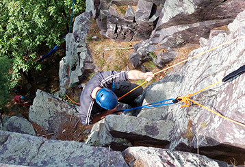
No mobile version available

This portfolio is design for larger resolutions devices such as tablets or desktops. 

HELLO!

Welcome to my portfolio. With over a decade of UX experience, I specialize in crafting visually stunning and user-centric designs, as well as building and growing UX teams. Take a look around my portfolio!

12

Years of Experience

317

Successful Projects

76,321

Happy Users

Download my resume to check out my work history and experience.

A Bit About Me

Rock Climber

I have been passionately pursuing rock climbing for a couple of years now, starting my journey indoors at Vertical Endeavors, my local climbing gym. Recently, I ventured into the great outdoors and explored various breathtaking locations in the Midwest. Among them, my absolute favorite outdoor destination has to be Devils Lake in WI.
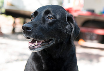
Dog Whisper

I love Doggos! They have been an integral part of my life since childhood, and I've had the privilege of training numerous furry companions over the years. The bond and joy I experience with dogs are unparalleled. I'm always thrilled to discuss topics like dog psychology, training methods, and behavioral reconditioning.
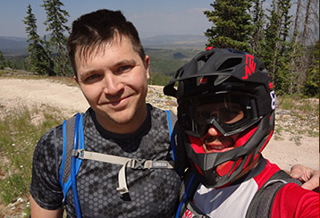
Mountain Biker

I find immense joy in exploring the vast landscapes of this magnificent country on two wheels. Since 2009, I've been passionately engaged in mountain biking, an exhilarating pursuit that has taken me to breathtaking trails across the United States. My favorite places include Sedona, Grand Junction, Moab, and Copper Harbor.

Skill Stack

Research

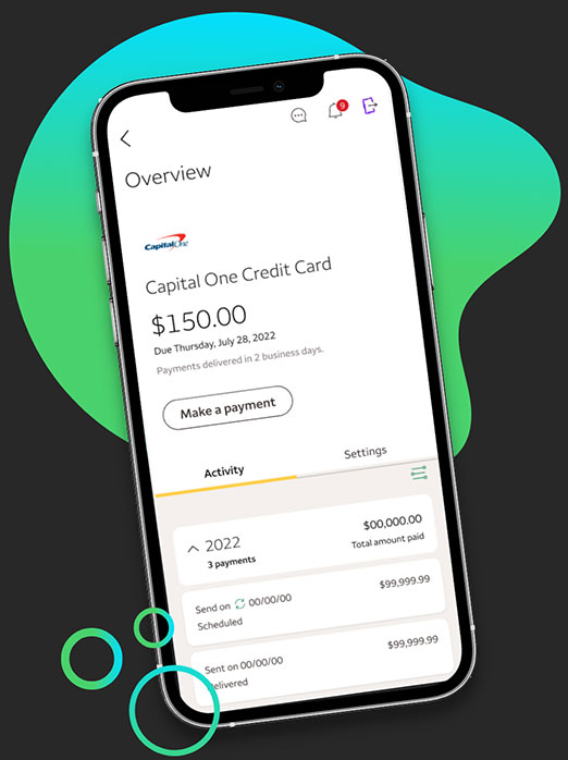
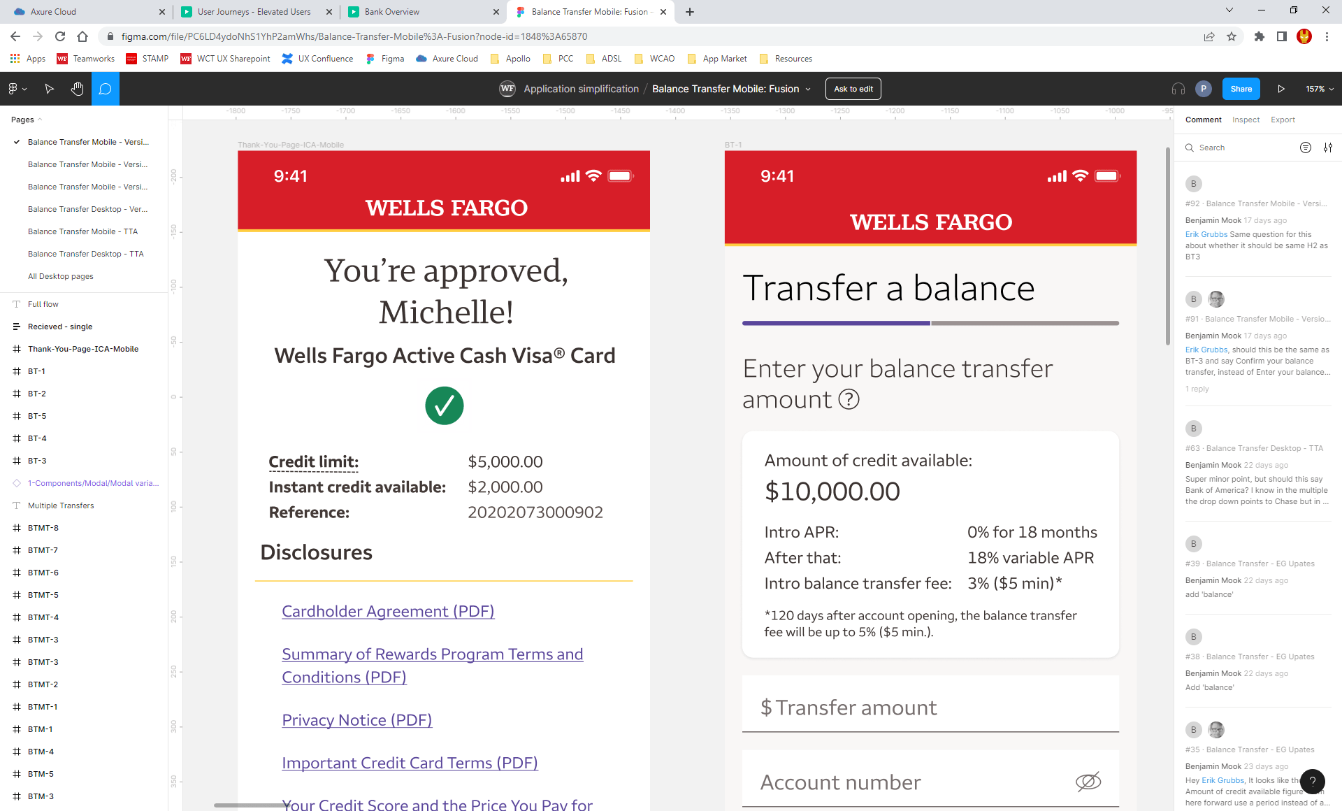
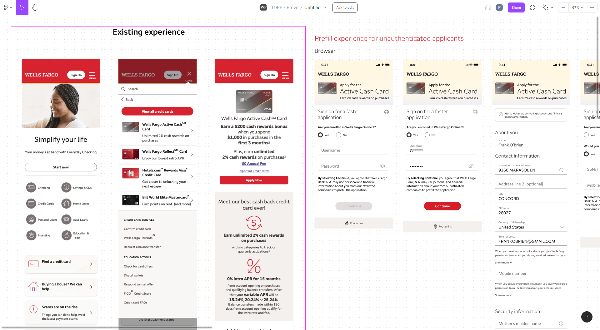
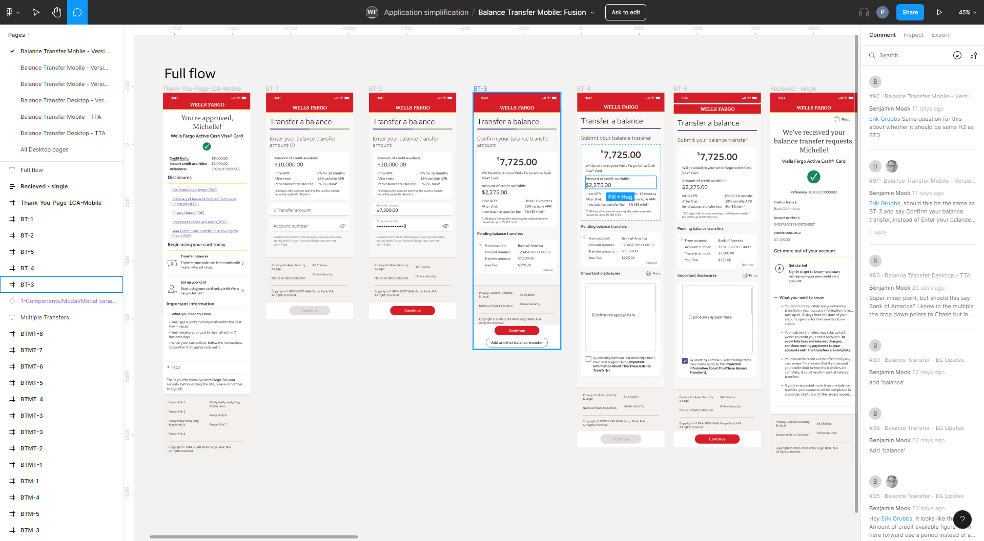
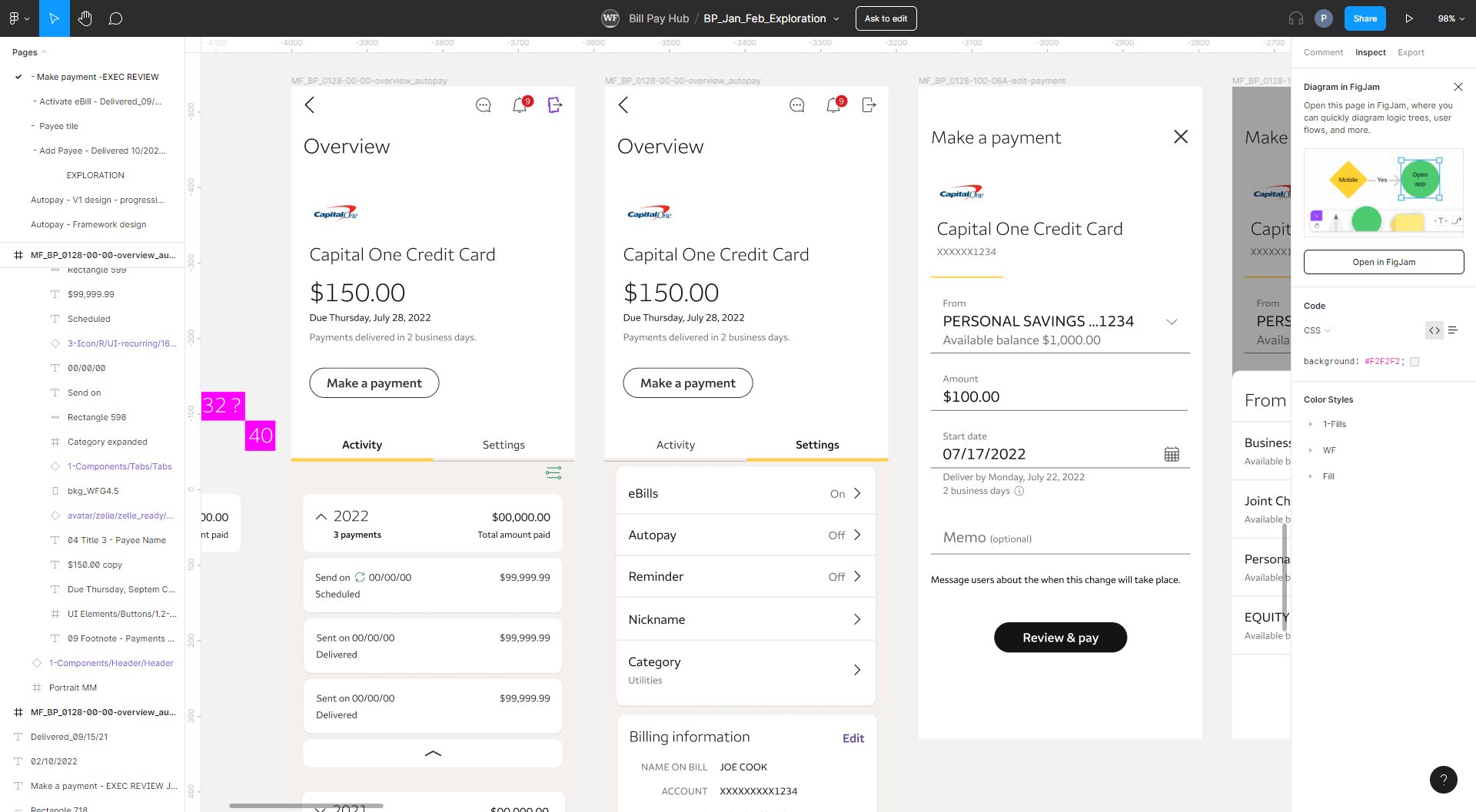
Qualitative research including user interviews and surveys. Quantitative research including analytics and heatmaps. Expert reviews such as Heuristic research.
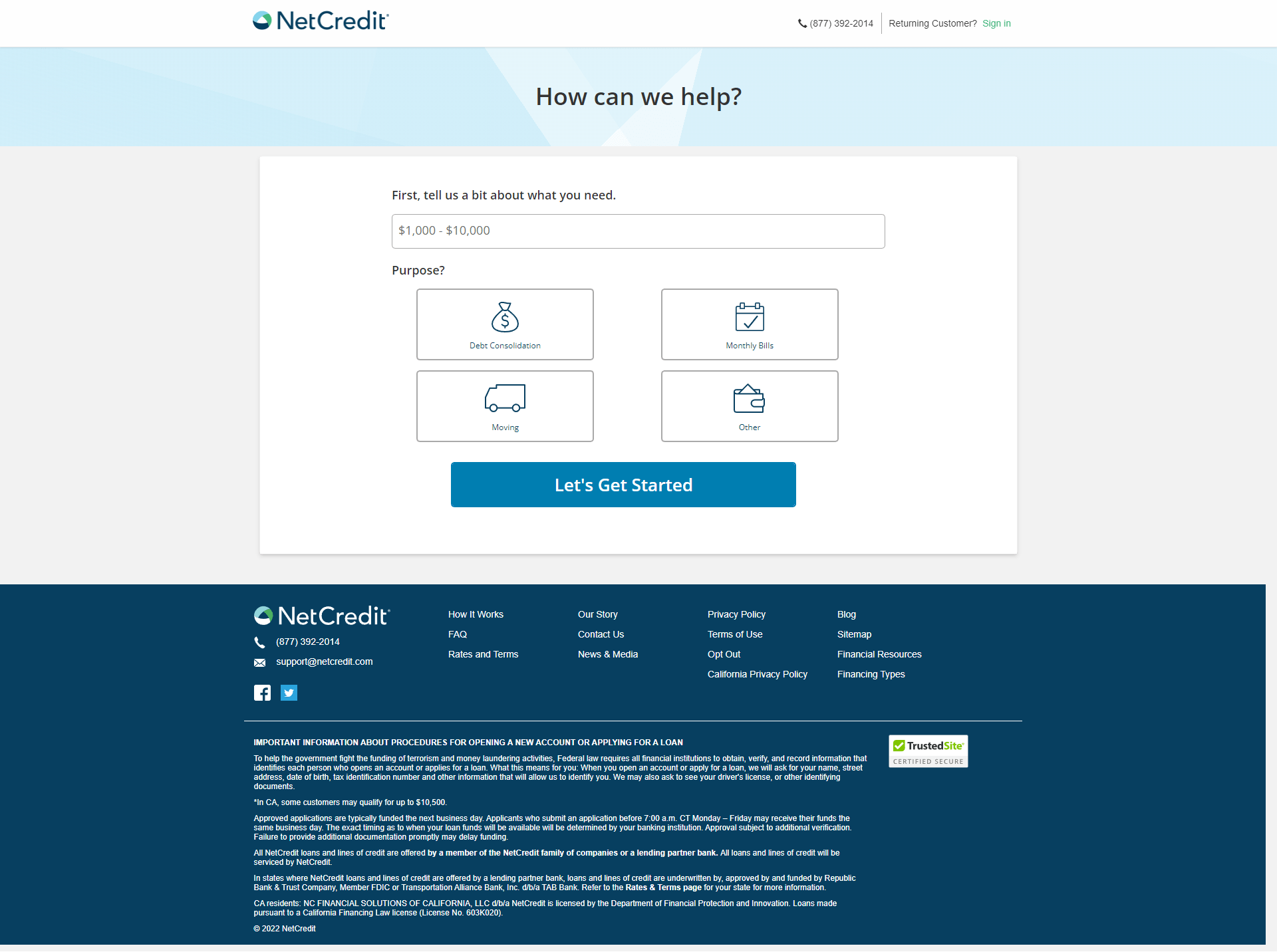
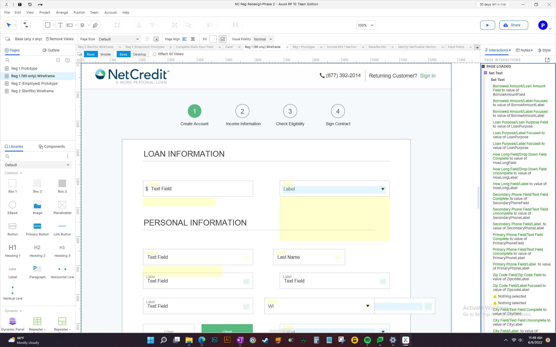
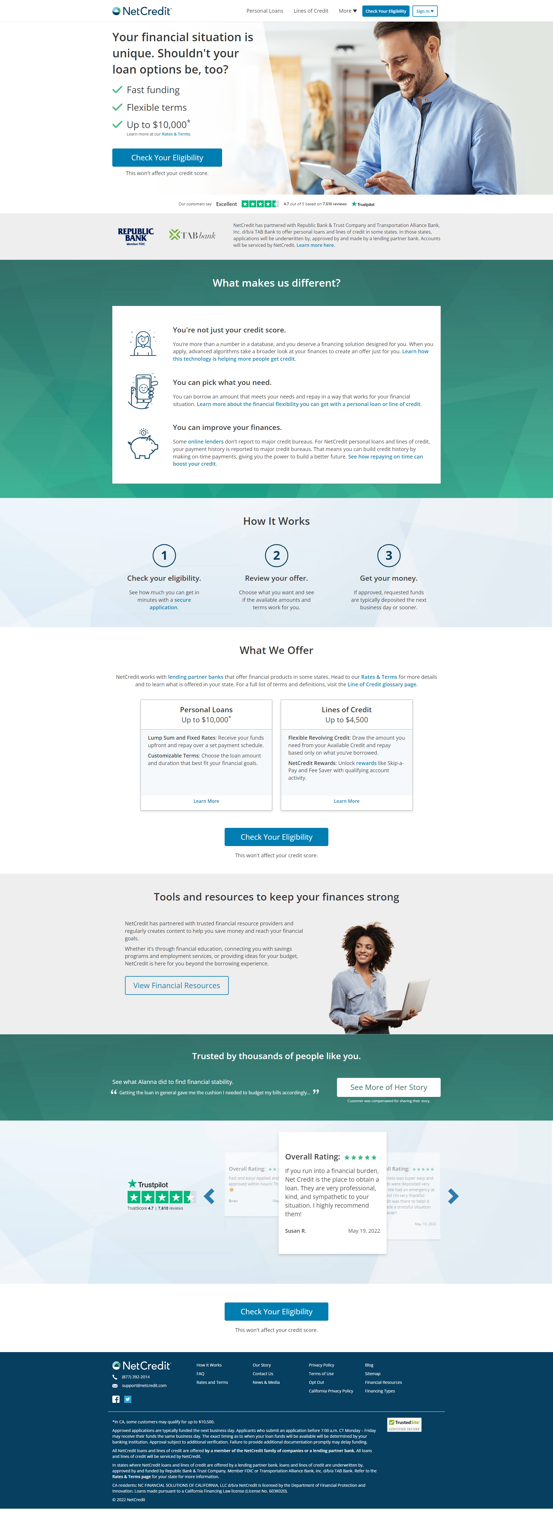
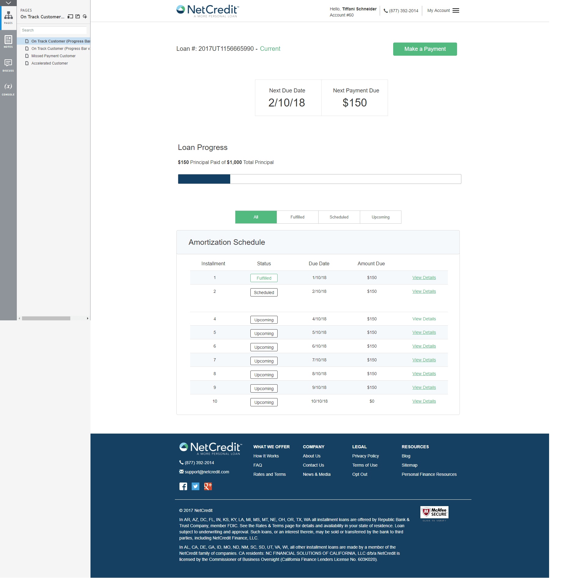
Wireframing

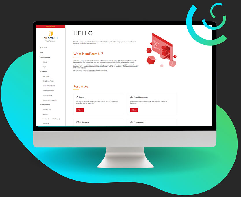
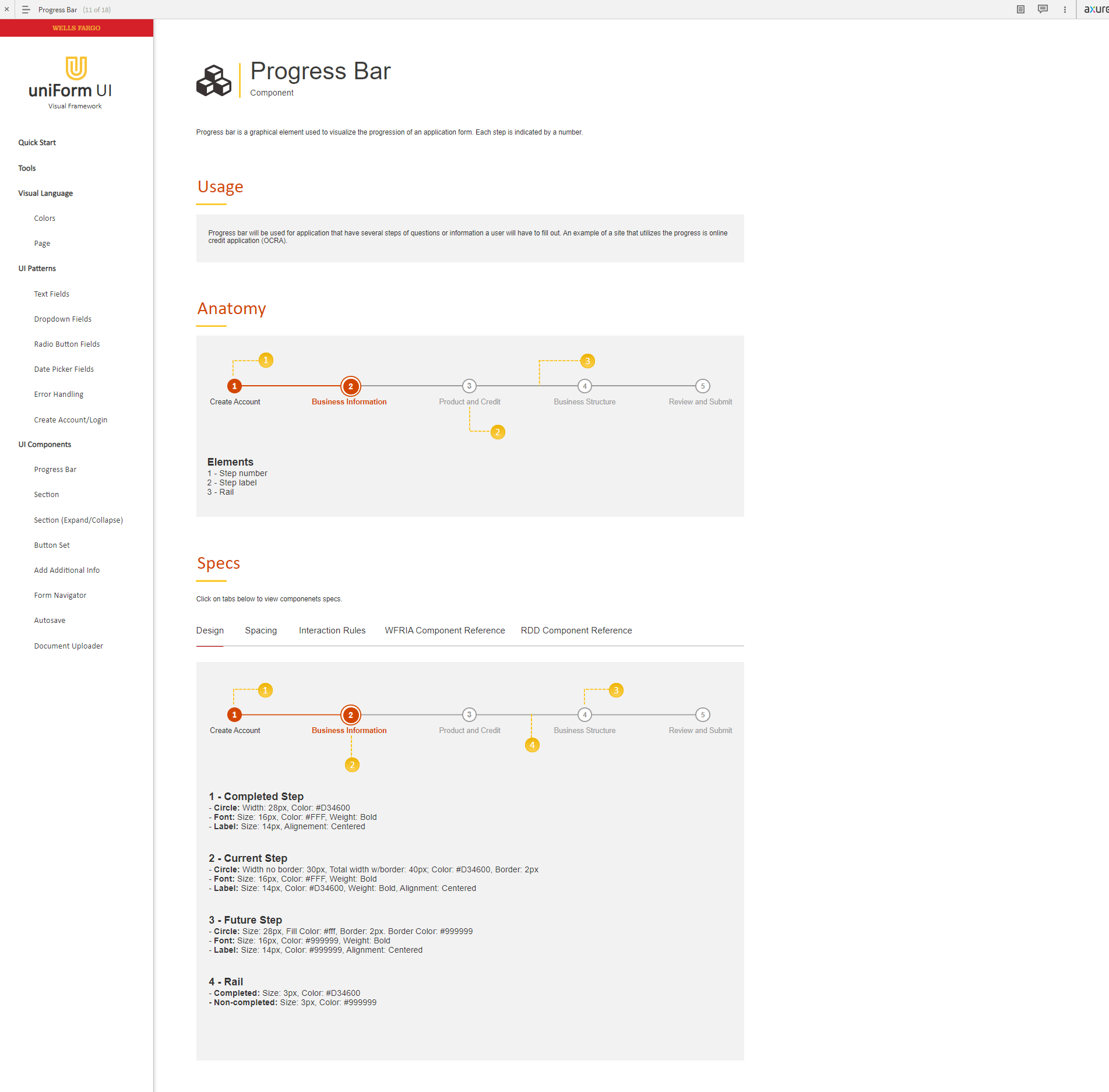
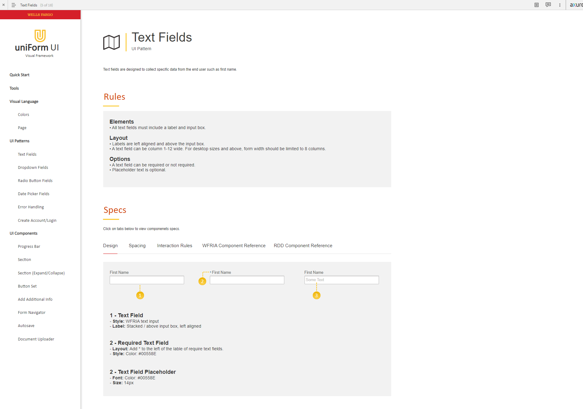
Sketches, low fidelity, high fidelity, and mockup wireframes using tools such as Figma and Axure.

Prototyping

Simple to complex interactions for desktop and mobile applications.

Usability Testing

Moderated and unmoderated sessions using tools such as Maze, UserTesting, and Loop 11.

Systems and Processes

Design thinking process, design systems, project requirements, and user story creation.

Design Sprints

Lead and participate in 4-day design sprints and lighting design jams.

Agile Methologies

Follow Agile, Scrum, and Kanban best practices. Create Kanban and Scrum boards using Jira.

Building Teams

Grow and expand UX design teams consisting of mentoring, design feedback, project next steps, resource allocation, and career growth paths.

Teams

With over 12 years of experience as a UX/UI designer and architect, I have thrived in diverse team environments, ranging from cross-functional collaborations to leading as the sole UX designer and seamlessly joining established teams. Whether building new teams from the ground up or integrating into existing workflows, I bring a versatile skill set and a passion for finding solutions to complex problems.

Solo UX Designer

As a solo UX designer, I take full ownership of the design process, delivering impactful results. I excel at translating concepts into wireframes, mockups, and prototypes while prioritizing user-centered design principles.

Cross-functional Collaboration

With extensive experience collaborating with cross-functional teams, I bring together professionals from diverse disciplines to achieve project goals. By fostering effective communication and aligning objectives, I seamlessly integrate design with development, marketing, and product management departments.

UX Team Formation

As a founding member of Enova International's UX team, I played a crucial role in its establishment and growth. Through talent nurturing, process definition, and design system implementation, I successfully built a team of six designers, fostering a collaborative and innovative environment.

Integration into Established Teams

I have seamlessly integrated into established teams at Wells Fargo and FloQast, leveraging their existing workflows. By providing a unique perspective and skill set, I have contributed to their success. Comfortable leading projects and collaborating with colleagues, I am adept at finding solutions to complex problems. My hands-on approach allows me to influence projects from inception to completion.

Projects Overview

This section provides an overview of the projects I have been involved in throughout the years. While these descriptions offer a high-level understanding, they do not delve into the specifics. If you are interested in exploring a project in greater detail, please scroll down to access a comprehensive case study that provides an in-depth analysis.

Web Apps

Deal Loan Onboarding

Throughout my career, I have gained experience working on a wide range of B2B and B2C web applications. Here is an example of a notable web application project I was involved in:

Overview

  • Company: Wells Fargo
  • Project: Deal Loan Onboarding
  • Title: Senior Lead UX Designer

Project

Deal Onboarding is an B2B application to help Wells Fargo loan officers onboard new loans submitted by business customers. The application was an entirely new application.

Responsibilites

  • Lead designer
  • Worked with cross-functional teams
  • Created and executed UX strategy for new application
  • Mentored other designers
  • Conducted Quantitative and Qualitative research
  • Conducted usability tests
  • Created wireframes, prototypes, and user stories

Results Highlights

  • 36% reduction in loan onboarding time
  • 30% increase in loan officer productivity
  • Achieved 99% accuracy in loan data validation

Additional Wireframes

Additional Wireframes

Web Sites

NetCredit

I have also worked on dozens of websites over the years. Here is an example of a notable website project I was involved in:

Overview

  • Company: Enova
  • Project: NetCredit
  • Title: Lead UX Designer

Project

NetCredit is under the Enova International brand. NetCredit provides personal loans up to $10,000 and line of credit up to $4,000. The project was a complete redesign of a 6 year old site.

Responsibilites

  • Lead designer
  • Worked with cross-functional teams
  • Created wireframes, prototypes, and user stories
  • Conducted usability tests
  • Conducted Quantitative and Qualitative research
  • Created design system

Results Highlights

  • 40% increase in website conversion rate
  • 20% decrease in bounce rate
  • Achieved 50% growth in organic search traffic
  • Improved mobile responsiveness, resulting in a 30% increase in mobile conversion rate
  • Reduced page load time by 50%, enhancing overall user experience
  • Increased average session duration by 25%

Mobile Apps

Bill Pay

Working on mobile apps is another type of projects I’ve work on. Here is an example of a notable mobile app project I was involved in:

Overview

  • Company: Wells Fargo
  • Project: Bill Pay
  • Title: Senior Lead UX Designer

Project

Bill Pay is a mobile application for business customers to manage their business loans and make payments. This project was a complete redesign.

Responsibilites

  • Lead designer
  • Created personas and userflows
  • Created wireframes, prototypes, and user stories
  • Conducted usability tests
  • Conducted Quantitative and Qualitative research
  • Worked with cross-functional teams

Results Highlights

  • Achieve a 15% increase in the number of loan payments made through the mobile application.
  • Reduce customer support inquiries related to loan management by 25%.
  • Decrease the average time to complete loan payments by 20%, simplifying the payment flow.
  • 19% growth in loan payments made through the mobile application.
  • 25% reduction in customer support inquiries related to loan management.

Additional Wireframes

Additional Wireframes

Design Systems

uniForm Design System

In additional to applications and websites, I’ve also built design sytems. Here is an example of a notable Design System project I was involved in:

Overview

  • Company: Wells Fargo
  • Project: uniForm UI Design System
  • Title: Senior Lead UX Designer

Project

The uniForm Design System was created to help designers and developers follow standards and patterns for form based B2B applications.

Responsibilites

  • Lead designer
  • Built design system from the ground up
  • Maintained and managed design system

Results Highlights

  • Achieved a 70% adoption rate among internal design and development teams
  • 44% reduction in creating wireframes and prototypes

Case Study

In this section, I will take you on a case study deep dive to showcase my approach to projects and problem-solving. This case study provides a high-level overview of my methodology, highlighting the key steps I undertake from project inception to completion. While this overview will give you valuable insights, I would be happy to provide more comprehensive details and a walkthrough of the this case study over a video call. Let’s go!

Field Service Web Application

As a freelance Lead UX designer, I collaborated with Housecall Pro, a leading SaaS web application provider for field service technicians. Throughout the project, my role was crucial in strengthening Housecall Pro’s UX practice and elevating their web application by improving user experience and introducing new features.

Company

Housecall Pro

Role

Lead UX Designer
Individual Contributor

Team

1 Lead UX Designer (me)
1 Senior UX Designer (existing)
1 UX Designer (new hire)
1 UX Researcher (new hire)
1 Developer Manager 
4 Developers
1 Lead QA
2 QA

Tools

Figma
Figjam
Miro
Zeroheight
Confluence
Jira

Timeline

Total project time: 10 months
Design: 4.5 months
Development: 4 months
QA: 1.5 months

Deliverables

UX Strategy plan (me)
Research plan (researcher and I)
Qualitative research (researcher and I)
Wireframes (Senior, UX designer, and I)
Prototypes (Senior and I)
Usability tests (UX designer, researcher, and I)

Project Phases
1
UX Strategy
2
Discovery
3
Ideate
4
Test
5
Design
6
Test
7
Build

Problems and Goals

Challenges

When Housecall Pro approached me to join their team, they faced three key challenges:

  • Lack of a Strategic UX Strategy: The absence of a well-defined UX strategy hindered Housecall Pro’s ability to conduct thorough research, identify improvement areas, and drive innovation effectively.

  • Lackluster UX Design: The existing design lacked intuitive navigation, causing difficulties for users in locating features and completing tasks efficiently. This resulted in frustration, errors, and delays in service delivery.

  • Missing Features: The application’s feature set failed to meet the evolving needs and expectations of users, limiting their ability to perform tasks effectively and efficiently.

Goals

To overcome the challenges, we set clear goals aimed at the web application user experience.

  • Implementing UX Strategy: Create a comprehensive plan with a cross-functional team to address key factors such as challenges, research, pain points, and project goals, ensuring a holistic approach to improving the user experience.

  • Improving UX: Revamp the information architecture to enhance the logical organization of content, enabling users to easily locate and retrieve relevant information, resulting in heightened productivity and satisfaction.

  • Creating Innovative Features: Identify critical missing features and prioritize their implementation, focusing on empowering users to perform tasks efficiently, elevating the overall user experience, and maintaining a competitive edge in the market.

Project Phases Breakdown

UX Strategy

Phase 1

At the inception of the project, I recognized the need for a comprehensive UX strategy that would lay the foundation for success. I proposed to the team the importance of investing time and effort into formulating a clear UX approach, aligning it with business goals, and defining ideal outcomes. 

Discovery

Phase 2

The discovery phase marks the crucial stage of extensive research, where both myself and the UX researcher embarked on a journey to gain in-depth understanding of the end users. Our primary objective was to delve into their behaviors, pain points, and aspirations to inform the subsequent design decisions. Employing a diverse range of research methodologies, including qualitative interviews and heuristic analysis, we sought to unearth valuable insights that would serve as the bedrock for creating meaningful and user-centered experiences.

The first step in the discovery phase was to create a research plan. I wanted to start with a research plan because it provides a structured approach, ensuring a systematic and organized process of gathering insights. A research plan also helps establish clear direction, optimize resources, promote consistency and replicability, and address ethical considerations in the research process.

Here are some items that was covered in the research plan:

  • Goals
    • Ex. To understand user satisfaction and pain points with the current Housecall Pro web app.
  • Research methods
    • Qualitative: using remote interviews and surveys
  • Tools
    • Zoom (interviews) and SurveyMonkey (surveys)
  • Hypothesis
    • Ex. Users may express frustration with the current user interface and navigation.
  • Script
  • Recruiting participants
    • Paid ads, Facebook groups, and recruitment funnel
  • Participant compensation
Interviews

To gain insights into user frustrations with the old design of the application and identify areas where new features were lacking, our initial approach involved conducting user interviews. This method provided a valuable opportunity to understand users’ pain points, challenges, and expectations, allowing us to gather firsthand feedback.

Here are some stats for the interviews:

  • Used JTBD framework
  • 1 moderator (me) 1 note taker (UX Researcher)
  • Remote Sessions were 70 mins on average
  • 1 Participant per session
  • 7 Interviews scheduled
  • Completed in 1.5 months
Surveys

In addition to interviews, we also recognized the value of utilizing surveys to validate the insights gained. Surveys offered the advantage of reaching a broader audience, providing a wider range of perspectives. However, it was important to acknowledge that while surveys allow for a larger sample size, the depth of insights may be comparatively lower than that obtained through interviews. Therefore, by combining these research methods, we aimed to gather a comprehensive understanding of user experiences and preferences.

Here are some stats for the surveys:

  • Total number of surveys sent out: 50
  • Number of surveys completed: 23
  • Used 17 surveys
  • Surveys completed by employees of HVAC, electrical, and plumbing companies.
  • Mix of owners, technicians, and other staff members
  • Single-choice questions and text input
  • 12 questions

Once we had collected all the research data from both interviews and surveys, we consolidated the findings into a spreadsheet. We then analyzed the data to identify recurring pain point themes and compiled a list of observations. To gain further insights, we employed a Rainbow Spreadsheet, which visually highlighted the areas with the most significant gaps, enabling us to prioritize and address the key issues effectively.

Top 4 Findings

1

Navigation

The majority of participants, both from interviews and surveys, expressed their concerns about the lack of intuitiveness navigating the app.

2

Dashboard lacking

While all participants appreciated having a dashboard, they found the information provided on the old dashboard to be lacking in helpfulness or usefulness.

3

No messaging

Participants wanted the ability to have a inbox for messaging for field technicians and customers.

4

Manual Entry

Participants found it cumbersome to manually add services and materials when creating estimates and jobs. There wasn’t a way to record all services, materials and prices in one central location

Ideate

Phase 3

The subsequent phase of the project involved generating ideas for potential solutions. To approach this phase, I adopted a strategy that began with a high-level exploration, gradually diving into more specific design details. This approach allowed for a comprehensive exploration of possibilities while ensuring a focused and iterative progression towards refining the designs.

The ideation phase kicked off with the creation of a high-level user flow for the redesigned app and the introduction of new features. By starting with the user flow, we could concentrate on key aspects such as information architecture and navigation, gaining insights into the overall structure of the app and estimating the level of effort required. This approach allowed us to establish a solid foundation for the subsequent design process while ensuring a user-centered and efficient user experience.

Prior to diving into the creation of LoFi wireframes, I facilitated a collaborative ideation session with the UX team, encouraging each member to contribute design ideas aimed at addressing customer pain points. Drawing inspiration from diverse sources such as web applications, mobile apps, and print design, our team gathered a range of creative concepts. We then convened to share and evaluate these ideas, selecting the most promising ones to be implemented in the subsequent design phase. This collaborative approach fostered a dynamic and innovative environment, ensuring that a multitude of perspectives and inspirations were considered in our design exploration.

The collaboration between the Senior Designer and myself commenced with the development of high-level LoFi wireframes that embraced simplicity and a black-and-white visual style. Employing black and white wireframes initially allowed us to focus on the core objectives of LoFi wireframes, namely rapid iteration, evaluating the overall experience, and assessing the flow between screens. Additionally, we utilized placeholder text appropriately to convey content context without detracting from the wireframe’s purpose and intent. This approach facilitated an efficient and effective exploration of the user interface, enabling us to refine the user experience iteratively.

Main Nav

Dashboard

Pricebook

Test

Phase 4

The UX Researcher and I conducted usability testing using Maze to validate the resonance of our design ideas with users. To achieve this, we developed a range of tests and distributed links to participants who had previously taken part in interviews and surveys. Our testing methods included A/B split tests, 5-second tests, and flow tests, among others. By employing this diverse set of testing approaches, we were able to gather valuable insights and feedback to inform the iterative design process effectively.

Tested the following:

  • Main nav
  • Dashboard
  • Creating estimates, jobs, and customers
  • Price book feature

Top Feedback

1

Main Nav

Users expressed a positive perception of the proposed main navigation, finding it more intuitive, which in turn made the most commonly used sections of the app more easily accessible.

2

Dashboard

Users expressed a positive response towards the newly introduced sections of the dashboard, acknowledging their improved informativeness. However, they suggested reevaluating the placement and order of these sections. They prefer to have urgent information, such as unscheduled jobs and open invoices, displayed prominently at the top followed by the schedule for the day or week.

3

Pricebook

Users were ecstatic about having a dedicated section to manage prices associated with services, materials, and labor. However, they expressed a desire for a more streamlined process to add services from the price book. Instead of having to search, they simply wanted the ability to click and add services with ease.

Design

Phase 5

After an extensive collaboration within the UX design team, we reached a stage where we felt confident in crafting and finalizing HiFi wireframes. This involved close collaboration with project managers and developers, conducting thorough reviews and iterations of the wireframes before their official finalization. 

Notable design changes:

Displayed below are some examples of the wireframes that I, along with the Senior UX designer, created during this process.


Dashboard

Pricebook Landing Page

Pricebook Service Child Page

Pricebook Services List Child Page

Test

Phase 6

The UX Researcher and I did one last round of usability test to verify all final designs. We again used the same participants we’ve been using for all our research and testing.

Build

Phase 7

The development team followed a two-week sprint cadence, while the UX team aligned their deliverables with the progress of user stories and the backlog of work. When transferring UX deliverables to the development team, the handover included the following:

  • Finalized user stories
  • Completed wireframes and prototypes
  • Design specifications outlining visual and interactive elements
    • Interaction rules to guide the development process
    • Design notes documenting important considerations and rationale
    • Redlines highlighting precise measurements and specifications for implementation.

This comprehensive handover ensured a smooth transition from UX design to development, promoting clear communication and facilitating the accurate implementation of the design vision.

The Results

Registrations

31% increase in new user registrations within the following quarter of implementing the enhanced app features and user-centric design compared to the last two quarters.

Customer Reviews

Housecall Pro received an influx of positive customer testimonials, with a 33% increase from last year in customer testimonials highlighting improved user experience.

Estimate Creation

The time it took to create estimates and jobs was reduced by 37% compared to the old design.

Increased Revenue

27% increase in sales in the next 2 quarter year over year due to the improvements and new features added to the app.

Let's Get in Touch

Thank you for taking the time to view my portfolio. If you are interested in discussing any potential opportunities, please feel free to contact me via email or LinkedIn. I look forward to hearing from you.

Scroll to Top