No mobile version available
This portfolio is design for larger resolutions devices such as tablets or desktops.
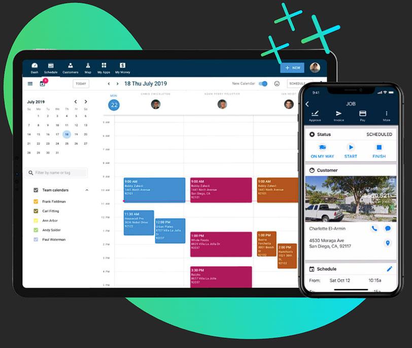
Field Service
Web App Project
Project Overview
As a freelance Lead UX designer, I collaborated with Housecall Pro, a leading SaaS web application provider for field service technicians. Throughout the project, my role was crucial in strengthening Housecall Pro’s UX practice and elevating their web application by improving user experience and introducing new features.
Company
Housecall Pro
Role
Lead UX Designer
Individual Contributor
Team
1 Lead UX Designer (me)
1 Senior UX Designer (existing)
1 UX Designer (new hire)
1 UX Researcher (new hire)
1 Developer Manager
4 Developers
1 Lead QA
2 QA
Tools
Figma
Figjam
Miro
Zeroheight
Confluence
Jira
Timeline
Total project time: 10 months
Design: 4.5 months
Development: 4 months
QA: 1.5 months
Deliverables
UX Strategy plan
Research plan
Qualitative research
Wireframes
Prototypes
Usability tests
Project Phases
Problems and Goals

Challenges
When Housecall Pro approached me to join their team, they faced three key challenges:
- Lack of a Strategic UX Strategy
The absence of a well-defined UX strategy hindered Housecall Pro’s ability to conduct thorough research, identify improvement areas, and drive innovation effectively. - Lackluster UX Design
The existing design lacked intuitive navigation, causing difficulties for users in locating features and completing tasks efficiently. This resulted in frustration, errors, and delays in service delivery. - Missing Features
The application’s feature set failed to meet the evolving needs and expectations of users, limiting their ability to perform tasks effectively and efficiently.

Goals
To overcome the challenges, we set clear goals aimed at the web application user experience.
- Implementing UX Strategy
Create a comprehensive plan with a cross-functional team to address key factors such as challenges, research, pain points, and project goals, ensuring a holistic approach to improving the user experience. - Improving UX
Revamp the information architecture to enhance the logical organization of content, enabling users to easily locate and retrieve relevant information, resulting in heightened productivity and satisfaction. - Creating Innovative Features
Identify critical missing features and prioritize their implementation, focusing on empowering users to perform tasks efficiently, elevating the overall user experience, and maintaining a competitive edge in the market.
Project Phases Breakdown
UX Strategy
Phase 1
At the inception of the project, I recognized the need for a comprehensive UX strategy that would lay the foundation for success. I proposed to the team the importance of investing time and effort into formulating a clear UX approach, aligning it with business goals, and defining ideal outcomes.

Discovery
Phase 2
The discovery phase marks the crucial stage of extensive research, where both myself and the UX researcher embarked on a journey to gain in-depth understanding of the end users. Our primary objective was to delve into their behaviors, pain points, and aspirations to inform the subsequent design decisions. Employing a diverse range of research methodologies, including qualitative interviews and heuristic analysis, we sought to unearth valuable insights that would serve as the bedrock for creating meaningful and user-centered experiences.

The first step in the discovery phase was to create a research plan. I wanted to start with a research plan because it provides a structured approach, ensuring a systematic and organized process of gathering insights. A research plan also helps establish clear direction, optimize resources, promote consistency and replicability, and address ethical considerations in the research process.
Here are some items that was covered in the research plan:
- Goals
- Ex. To understand user satisfaction and pain points with the current Housecall Pro web app.
- Research methods
- Qualitative: using remote interviews and surveys
- Tools
- Zoom (interviews) and SurveyMonkey (surveys)
- Hypothesis
- Ex. Users may express frustration with the current user interface and navigation.
- Script
- Recruiting participants
- Paid ads, Facebook groups, and recruitment funnel
- Participant compensation

Interviews
To gain insights into user frustrations with the old design of the application and identify areas where new features were lacking, our initial approach involved conducting user interviews. This method provided a valuable opportunity to understand users’ pain points, challenges, and expectations, allowing us to gather firsthand feedback.
Here are some stats for the interviews:
- Used JTBD framework
- 1 moderator (me) 1 note taker (UX Researcher)
- Remote Sessions were 70 mins on average
- 1 Participant per session
- 7 Interviews scheduled
- Completed in 1.5 months
Surveys
In addition to interviews, we also recognized the value of utilizing surveys to validate the insights gained. Surveys offered the advantage of reaching a broader audience, providing a wider range of perspectives. However, it was important to acknowledge that while surveys allow for a larger sample size, the depth of insights may be comparatively lower than that obtained through interviews. Therefore, by combining these research methods, we aimed to gather a comprehensive understanding of user experiences and preferences.
Here are some stats for the surveys:
- Total number of surveys sent out: 50
- Number of surveys completed: 23
- Used 17 surveys
- Surveys completed by employees of HVAC, electrical, and plumbing companies.
- Mix of owners, technicians, and other staff members
- Single-choice questions and text input
- 12 questions


Once we had collected all the research data from both interviews and surveys, we consolidated the findings into a spreadsheet. We then analyzed the data to identify recurring pain point themes and compiled a list of observations. To gain further insights, we employed a Rainbow Spreadsheet, which visually highlighted the areas with the most significant gaps, enabling us to prioritize and address the key issues effectively.
Top 4 Findings
1
Navigation
The majority of participants, both from interviews and surveys, expressed their concerns about the lack of intuitiveness navigating the app.
2
Dashboard lacking
While all participants appreciated having a dashboard, they found the information provided on the old dashboard to be lacking in helpfulness or usefulness.
3
No messaging
Participants wanted the ability to have a inbox for messaging for field technicians and customers.
4
Manual Entry
Participants found it cumbersome to manually add services and materials when creating estimates and jobs. There wasn’t a way to record all services, materials and prices in one central location
Ideate
Phase 3
The subsequent phase of the project involved generating ideas for potential solutions. To approach this phase, I adopted a strategy that began with a high-level exploration, gradually diving into more specific design details. This approach allowed for a comprehensive exploration of possibilities while ensuring a focused and iterative progression towards refining the designs.

The ideation phase kicked off with the creation of a high-level user flow for the redesigned app and the introduction of new features. By starting with the user flow, we could concentrate on key aspects such as information architecture and navigation, gaining insights into the overall structure of the app and estimating the level of effort required. This approach allowed us to establish a solid foundation for the subsequent design process while ensuring a user-centered and efficient user experience.

Prior to diving into the creation of LoFi wireframes, I facilitated a collaborative ideation session with the UX team, encouraging each member to contribute design ideas aimed at addressing customer pain points. Drawing inspiration from diverse sources such as web applications, mobile apps, and print design, our team gathered a range of creative concepts. We then convened to share and evaluate these ideas, selecting the most promising ones to be implemented in the subsequent design phase. This collaborative approach fostered a dynamic and innovative environment, ensuring that a multitude of perspectives and inspirations were considered in our design exploration.
The collaboration between the Senior Designer and myself commenced with the development of high-level LoFi wireframes that embraced simplicity and a black-and-white visual style. Employing black and white wireframes initially allowed us to focus on the core objectives of LoFi wireframes, namely rapid iteration, evaluating the overall experience, and assessing the flow between screens. Additionally, we utilized placeholder text appropriately to convey content context without detracting from the wireframe’s purpose and intent. This approach facilitated an efficient and effective exploration of the user interface, enabling us to refine the user experience iteratively.
Main Nav

Dashboard

Pricebook

Test
Phase 4
The UX Researcher and I conducted usability testing using Maze to validate the resonance of our design ideas with users. To achieve this, we developed a range of tests and distributed links to participants who had previously taken part in interviews and surveys. Our testing methods included A/B split tests, 5-second tests, and flow tests, among others. By employing this diverse set of testing approaches, we were able to gather valuable insights and feedback to inform the iterative design process effectively.
Tested the following:
- Main nav
- Dashboard
- Creating estimates, jobs, and customers
- Price book feature

Top Feedback
1
Main Nav
Users expressed a positive perception of the proposed main navigation, finding it more intuitive, which in turn made the most commonly used sections of the app more easily accessible.
2
Dashboard
Users expressed a positive response towards the newly introduced sections of the dashboard, acknowledging their improved informativeness. However, they suggested reevaluating the placement and order of these sections. They prefer to have urgent information, such as unscheduled jobs and open invoices, displayed prominently at the top followed by the schedule for the day or week.
3
Pricebook
Users were ecstatic about having a dedicated section to manage prices associated with services, materials, and labor. However, they expressed a desire for a more streamlined process to add services from the price book. Instead of having to search, they simply wanted the ability to click and add services with ease.
Design
Phase 5
After an extensive collaboration within the UX design team, we reached a stage where we felt confident in crafting and finalizing HiFi wireframes. This involved close collaboration with project managers and developers, conducting thorough reviews and iterations of the wireframes before their official finalization.
Notable design changes:
- Redesigned main header navigation
- Redesigned dashboard
- New Pricebook section
- New Inbox section
- New estimate comparison feature
Displayed below are some examples of the wireframes that I, along with the Senior UX designer, created during this process.
Dashboard

Pricebook Landing Page

Pricebook Service Child Page

Pricebook Services List Child Page

Creating an estimate

Completed Estimate

Present Estimate to Customer


Test
Phase 6
The UX Researcher and I did one last round of usability test to verify all final designs. We again used the same participants we’ve been using for all our research and testing.
Build
Phase 7

The development team followed a two-week sprint cadence, while the UX team aligned their deliverables with the progress of user stories and the backlog of work. When transferring UX deliverables to the development team, the handover included the following:
- Finalized user stories
- Completed wireframes and prototypes
- Design specifications outlining visual and interactive elements
- Interaction rules to guide the development process
- Design notes documenting important considerations and rationale
- Redlines highlighting precise measurements and specifications for implementation.
This comprehensive handover ensured a smooth transition from UX design to development, promoting clear communication and facilitating the accurate implementation of the design vision.
The Results
Registrations
31% increase in new user registrations within the following quarter of implementing the enhanced app features and user-centric design compared to the last two quarters.
Customer Reviews
Housecall Pro received an influx of positive customer testimonials, with a 33% increase from last year in customer testimonials highlighting improved user experience.
Estimate Creation
The time it took to create estimates and jobs was reduced by 37% compared to the old design.
Increased Revenue
27% increase in sales in the next 2 quarter year over year due to the improvements and new features added to the app.
Let's Get in Touch
Thank you for taking the time to view my portfolio. If you are interested in discussing any potential opportunities, please feel free to contact me via email or LinkedIn. I look forward to hearing from you.
- philjstark@gmail.com
- South Elgin, IL