No mobile version available
This portfolio is design for larger resolutions devices such as tablets or desktops.
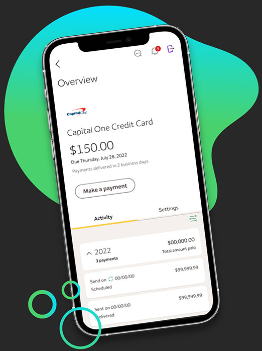
Bill Pay
Mobile App Project
Project Overview
Bill Pay is a mobile application developed by Wells Fargo, empowering customers to effortlessly manage their credit card and mortgage accounts while providing a convenient platform for making secure payments. The project included improving existing screens and adding new features.
Company
Wells Fargo
Role
Senior Lead UX Designer
Individual Contributor
Team
1 Senior Lead UX Designer (me)
1 UX Designer
1 UX Researcher
1 Developer Manager
5 Developers
2 QA
Tools
Figma
Figjam
Confluence
Jira
Maze
Timeline
Total project time: 13 months
Design: 5 months
Development: 6 months
QA: 2 months
Deliverables
Research plan
Qualitative research
Wireframes
Prototypes
Usability tests
Project Phases
Problems and Goals

Challenges
There were 3 challenges the team and I faced:
- Simplifying Complex Workflows
One of the main challenges we encountered was simplifying the often complex workflows associated with managing credit card and mortgage payments. Our team strived to create an intuitive user experience that would enable users to effortlessly navigate through the app and complete their tasks efficiently. - Ensuring Security without Compromising Usability
Another critical challenge we faced was striking the right balance between security and usability. As a banking application, Bill Pay required robust security measures, but we also wanted to ensure that the user experience remained seamless and hassle-free. Our team worked diligently to implement state-of-the-art security protocols without compromising the usability of the app. - Integration and Adoption
Integrating the Bill Pay app into Wells Fargo’s existing infrastructure and ensuring high user adoption presented a significant business challenge. We focused on creating a seamless integration process and developing a marketing strategy that would effectively communicate the benefits of the app to Wells Fargo customers, encouraging them to embrace this new digital solution.

Goals
To address the challenges we faced, our team established the following goals, guiding our efforts towards overcoming obstacles and delivering results.
Enhance User Experience
Our primary goal was to provide users with a streamlined and intuitive interface that simplifies the management of credit card and mortgage payments. By understanding user needs and pain points, we aimed to deliver an exceptional user experience that would exceed customer expectations.Ensure Security and Trust
Building a high level of trust and security was paramount. We set out to implement industry-leading security features to protect users’ sensitive financial information, ensuring their peace of mind while using the app.Drive User Adoption and Engagement
To achieve success, it was crucial to drive user adoption and engagement. Our goal was to design and promote the Bill Pay app in a way that encouraged widespread adoption among Wells Fargo customers, empowering them to take control of their financial transactions and enjoy the convenience of mobile banking.
Project Phases Breakdown
Discovery
Phase 1
The Discovery phase of the Bill Pay project played a pivotal role in our journey towards creating a seamless and user-centric mobile banking experience. Through meticulous research and exploration, we delved deep into the needs, pain points, and preferences of Wells Fargo customers when it came to managing their credit card and mortgage payments. By understanding their unique challenges and aspirations, we aimed to lay a solid foundation for designing an application that would exceed their expectations.

The PM and I crafted a comprehensive research plan to identify user needs, pain points, and preferences through various qualitative and quantitative research methods.
Here are some items that was covered in the research plan:
- Goals
- Research methods
- Tools
- Hypothesis
- Recruiting participants
- Participant compensation

Remote Interviews
Within the Discovery phase of the Bill Pay project, qualitative research emerged as a cornerstone in our quest to understand the nuanced needs and experiences of Wells Fargo customers. Through remote interviews, we aimed to gain in-depth insights into users’ perspectives, motivations, pain points, and aspirations regarding credit card and mortgage management. By adopting a qualitative research approach, we sought to capture rich, contextual information that would inform the design and development of the Bill Pay app, ensuring it met users’ expectations and delivered a superior mobile banking experience.
Recruitment Process: We carefully identified and recruited a diverse group of Wells Fargo customers who represented different demographics, account types, and usage patterns. This ensured a well-rounded understanding of various user segments.
Structured Interview Guide: We developed a comprehensive interview guide that incorporated open-ended questions, probing techniques, and scenarios to explore users’ behaviors, preferences, and pain points related to credit card and mortgage management.
- Note-Taking and Transcription: During the interviews, our research team took detailed notes to capture key insights, observations, and user feedback. These notes were later transcribed for analysis, ensuring accuracy and thoroughness in the research findings.

Through thorough analysis of research data, I synthesized key findings and identified actionable insights to guide the design and development process. Once I had collected all the research data from interviews, I consolidated the findings into a spreadsheet.
Top Findings
1
Notification Center
Participants emphasized the importance of personalized notifications and reminders for upcoming credit card payment due dates. They desired proactive alerts that would help them avoid late payments and potential fees.
2
Security
Users expressed a strong need for enhanced security features within the app, such as biometric authentication and real-time fraud alerts. They emphasized the importance of feeling confident and protected when managing their financial transactions.
3
Track Spending
Participants expressed a desire for more intuitive ways to track and analyze their credit card spending. They requested interactive visualizations and customizable reports that would provide a comprehensive overview of their expenses.
Ideate
Phase 2
The Ideate phase of the Bill Pay project is a creative turning point where we transform research insights into innovative design concepts. In this section, we explore our process of drawing inspiration, generating ideas, and crafting low-fidelity wireframes. By combining industry best practices and user feedback, we ensure that the Bill Pay app is thoughtfully designed and user-centric, addressing the challenges and aspirations of Wells Fargo customers.

I drew inspiration from a diverse range of industries, exploring design trends and best practices beyond the financial sector. I sought insights from various sources to enrich our understanding and generate creative ideas for the app’s redesign. Here are some of the inspirations I explored:
- Hospitality: By examining the seamless and personalized experiences offered by top-notch hotels and hospitality platforms, we aimed to bring a similar level of attention to detail and customer-centricity to the Bill Pay app.
- Social media: Analyzing the engaging and intuitive interfaces of popular social media platforms, we sought to incorporate elements that promote user interaction, social connectivity, and an enjoyable digital experience within the app.
- Travel and transportation: Drawing inspiration from travel and transportation apps, we explored how to design a seamless and efficient user flow that simplifies the process of managing credit card and mortgage payments, much like the ease of planning and booking travel itineraries.
- Productivity tools: Examining productivity apps and software, we aimed to incorporate features and design elements that boost user productivity and efficiency in managing their financial obligations, allowing them to effortlessly stay on top of their payments.
Leveraging the insights gained from research and ideation, I created low-fidelity wireframes to visualize the app’s structure, layout, and interactions.

Design
Phase 3
Upon finalizing the LoFi wireframes and achieving alignment within the team, we entered a stage of certainty that propelled us towards the meticulous crafting and refinement of High-Fidelity (HiFi) wireframes. This collaborative effort entailed close collaboration with project managers and developers, engaging in thorough reviews and iterative cycles to comprehensively refine the wireframes before finalizing them.
Notable design changes:
- Streamlined account switching
- Enhanced payment reminders
- Improved data visualization
- Refined security features
Below are some examples of wireframes I created.


Test
Phase 4

I conducted usability testing using Maze to validate the effectiveness and resonance of our design ideas with users. To achieve this, a series of A/B split tests were developed and distributed to participants who had previously participated in surveys, ensuring a diverse range of perspectives. The A/B split tests specifically focused on key design elements and user flows within the Bill Pay app, allowing us to gather valuable insights and feedback to inform the iterative design process effectively.
Here are some of the sections of the app I focused on:
Account Switching
Payment Reminders
- Home screen
- Account details
- Payments
Top Feedback
1
Home Screen
The redesigned home screen received positive feedback from users due to its clear and intuitive layout. The inclusion of summarized account information, such as balances and payment due dates, provided users with a quick overview of their credit card and mortgage accounts. The addition of personalized widgets and shortcuts for common actions, such as making payments or viewing transactions, improved efficiency.
2
Payment Reminders
Participants appreciated the personalized and timely payment reminders, which helped them stay on track with their credit card payments. The concise and informative content, coupled with prominent placement within the app, garnered positive feedback and increased user engagement with the payment reminder feature.
3
Security Improvements
Users expressed confidence in the app’s advanced biometric authentication methods, such as fingerprint and facial recognition, which provided secure login experiences. Real-time fraud detection alerts were also well-received, enhancing users’ trust and ensuring proactive protection for their financial transactions. The robust security features in the Bill Pay app contributed to a sense of reliability and peace of mind in managing credit card and mortgage account
Build
Phase 5

The final step was to hand over deliverables to the development team. The handover included the following:
- Completed wireframes and prototypes
- Finalized user stories
- Design specifications outlining visual and interactive elements
- Interaction rules to guide the development process
- Design notes documenting important considerations and rationale
- Redlines highlighting precise measurements and specifications for implementation.
The Results
Task Completion Time
Task completion time reduced by 30% after implementing a simplified and intuitive workflow, streamlining the process of managing credit card and mortgage payments within the app. Users were able to complete tasks more efficiently and with greater ease.
Enhanced User Experience
CSAT score increased by 15% as users reported a significantly improved experience with the redesigned Bill Pay app. Positive feedback was received regarding the intuitive interface, seamless navigation, and personalized features, leading to a higher level of user satisfaction.
User Adoption Rate
User adoption rate exceeded expectations, with a 40% increase in the number of Wells Fargo customers actively using the Bill Pay app. The enhanced design, combined with effective marketing strategies, successfully promoted user engagement and encouraged wider adoption of the app.
Security Incident Rate
Security incident rate decreased by 25% after implementing advanced security features, including biometric authentication and real-time fraud detection alerts. Users felt more confident and secure in managing their financial transactions, resulting in a significant reduction in security-related incidents.
Let's Get in Touch
Thank you for taking the time to view my portfolio. If you are interested in discussing any potential opportunities, please feel free to contact me via email or LinkedIn. I look forward to hearing from you.
- philjstark@gmail.com
- South Elgin, IL